
I mentioned that I was coming back to Cape next week to look for sponsors and advertisers. After procrastinating way too long, I stayed up until 2 a.m. trying to come up with some iconic photos that would work for the business card and for headers on a redesigned web site.
Son Matt came up with several designs (you can see them below), but the one above is the best at capturing the voice of CapeCentralHigh.com.
- Everyone who grew up in Southeast Missouri in the 60s will recognize it.
- It’s black and white.
- It has the feel of the site.
- It’s visually interesting.
Someone’s farm from a speeding car
 This is the first design he sent me.
I really like the image. Based on the comments I received when it ran, so did you. The only problem was that it just a little bit too rural to say “Cape Girardeau” at first glance. Cape’s a relatively small town, but it IS a town.
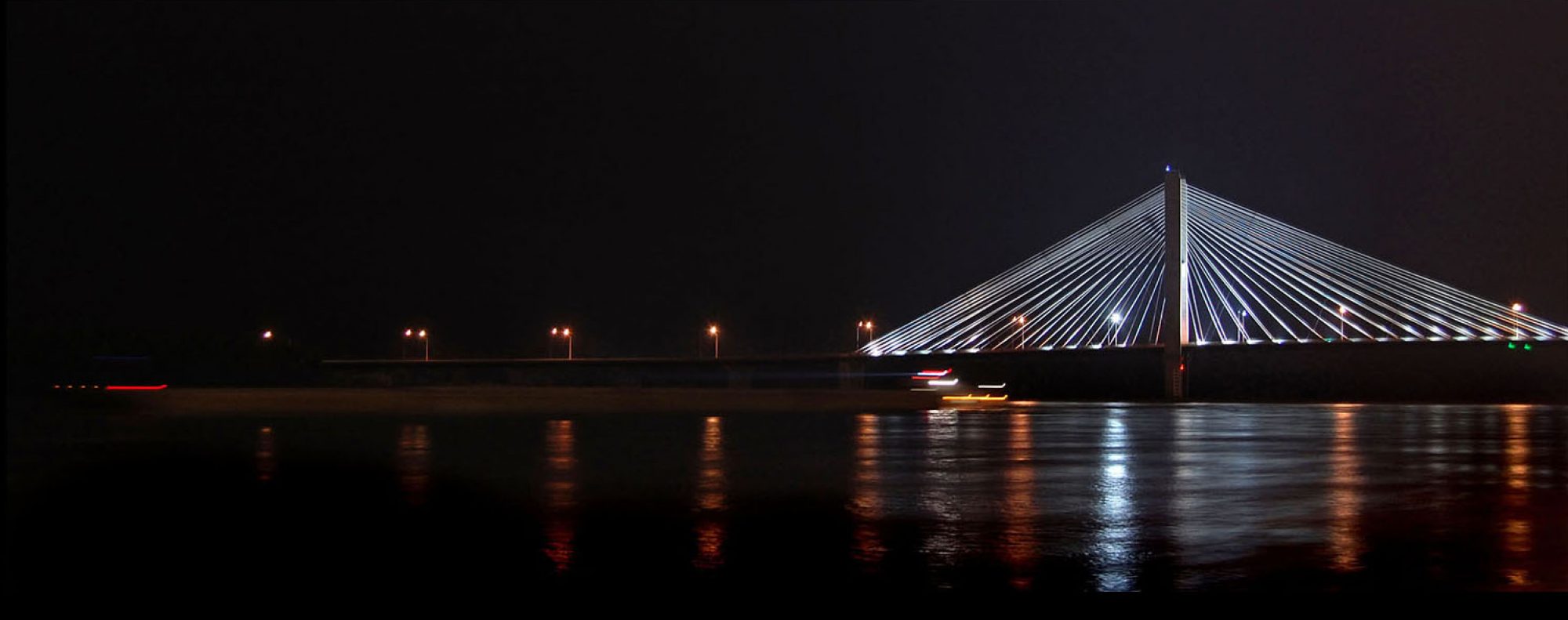
The Bill Emerson Bridge was striking
 Wife Lila’s eyes popped when she saw it. It’s great from a graphical standpoint. The subtle colors are nice and the elements come together to give a nice place to put the text. It was also the subject of my very first blog post on Oct. 20, 2009.
It would make a GREAT business card for someone in Cape, but it screams Today, and my site is all about Yesterday.
Then Matt tried the old Traffic Bridge

I knew right away that this was going to be the one, but I didn’t like the Class of 1965 line. That’s not to say that I’m not proud to be a member of the Central High School Class of 1965. I am.
It’s just that that’s not particularly relevant to the site nor to who I am. I’ve never identified much with the schools I attended, whether it was Central, SEMO or Ohio University. I was always a photographer, an observer on the sidelines, whose primary allegiance was to the publication I was working for, whether it was The Tiger, The Girardot, The Capaha Arrow, The Sagamore, The Jackson Pioneer or The Missourian.
Besides, the site has already switched from a narrow focus on a single high school in Cape Girardeau to the area as a whole. I’ve run pictures of shoppers in Jackson (even if I didn’t know that’s where I was), an I-55 interchange at Scott City, the Bald Knob Cross, Ernie Chiles riding around Horseshoe Lake and written about my wooden stick phobia because of Dr. Herbert.
I have Notre Dame and College High students clamoring to see their pictures and I’ve just scraped the surface of my SEMO art.
I had him change Class of 1965 to 1960s Cape Girardeau. I’d like to have used Coming of Age in Southeast Missouri, but that was too long.
Brother Mark weighs in

I sent the choices to my brother Mark, who does advertising for Schnucks. (I see they spell it without the apostrophe these days.) Being my brother, he wee-weed all over my choices and pitched the shot above.
Matt asked if I could reshoot it with the film arranged differently so the type would show up better. “You can shoot it in black and white, if you like,” he said.
I explained that I had a couple of problems with the image
- It couldn’t be re-shot. I took it while I was unrolling the Coffee Can Film for sleeving in plastic pages. That train had already pulled out of the station.
- It looks like I’m pitching photo finishing or commercial photography, not nostalgia. It’s not a bad graphic, it’s just not the message I wanted to convey.
Cape Girardeau , The City of Roses
 That reminded me that Mark has a bunch of Cape memorabilia at his home in St. Louis. Way over in the corner of a picture, I had this shot of a City of Roses license plate frame. THAT would have made a great graphic, but the quality wasn’t good enough. I’m going to reshoot it when I go back home. It might find its way onto a page header.
What do you think?
The RIGHT answer is that I made the right choice. Remember, I have photos and I’m not afraid to use them.
I like your choice, but would have left off the http:// and the trailing / in the address.
When I go through 1,000 cards and 50 magnets, I may change that.
Thank you for choosing the old bridge……awesome
Great choice for the business card; definitely my favorite.
Ken, how about the mosaic on the side of the Missourian building?
Dennis,
I looked hard at that. In fact, pieces of it may show up in the page header at some point.
The only reason I didn’t put it higher on the list is that it was a little busy and didn’t leave much room for type if I used the whole mural.
I wanted something that it said CAPE at first glance and thought the old bridge was something that everyone could identify with.